About a year or so ago, I heard a female political commentator talking about North American economic recovery. I can’t remember how she was connected to fashion or art or design or anything, but I remember her saying something about the color blue making a huge comeback as the economy recovered and people became more relaxed. “Bosh!” said I. Never happen. I’d been avoiding blue about that time thinking it was pedestrian. I always thought of blue as a sort of ‘default’ color. Like, “What’s your favorite color?” “Blue”. Y’know?
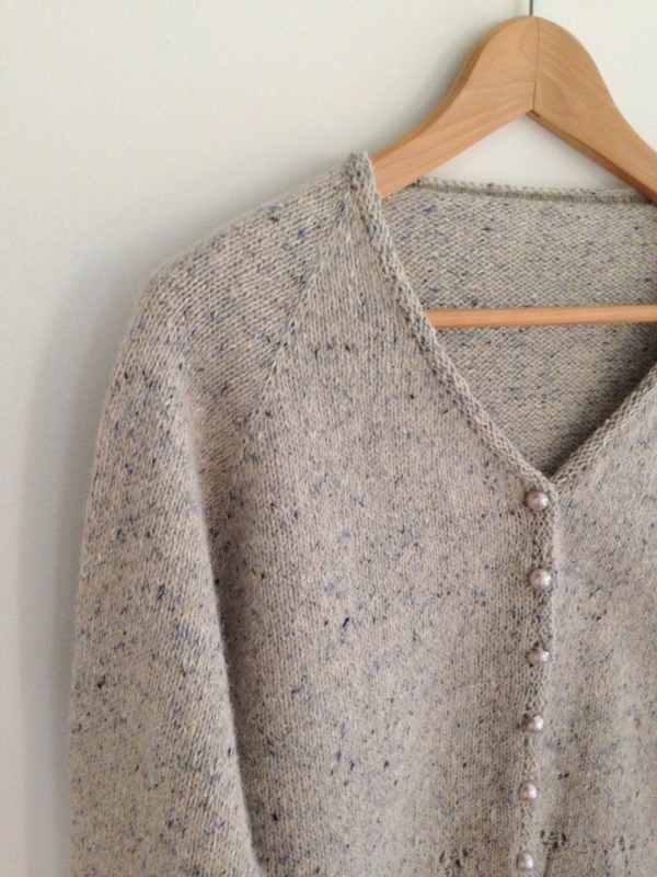
 But then yesterday when I was photographing a new acquisition, this lovely single ply sock yarn by Viking of Norway, I thought “Wow. Lot of blue lately, isn’t there?” Sure enough! I back tracked through my last few projects and yarn store purchases and found the color balance definitely in favor of blue. In fact, Aquamarine is the leading color for women’s wear this spring, according to the color mavens at Pantone.
Chefchaouen, Morocco is the ‘blue city’ where everything from sidewalks to houses is painted blue. This was done by Jewish refugees fleeing Hitler. The blue symbolizes heaven and earth and is a reminder to live a spiritual life.
There are so many shades of blue, so many nuances, that I am now embarrassed at how shallow I’d been. (I know [blue] puddles deeper than me!) If you’ve never checked out Design Sponge, now’s a good time. A while back, they did the most amazing “Color Of The Day” series using these charming retro color posters. They remind me of my science books from the 4th grade. The historical factoids on each poster are pretty fascinating too.
Now I think I need some blue fingerless gloves!






AndreSue
I love blue too! I heard that masala (a wine color) was supposed to be Pantone’s color of the year this year but I’m just not feeling it. Blue is definitely more fitting!